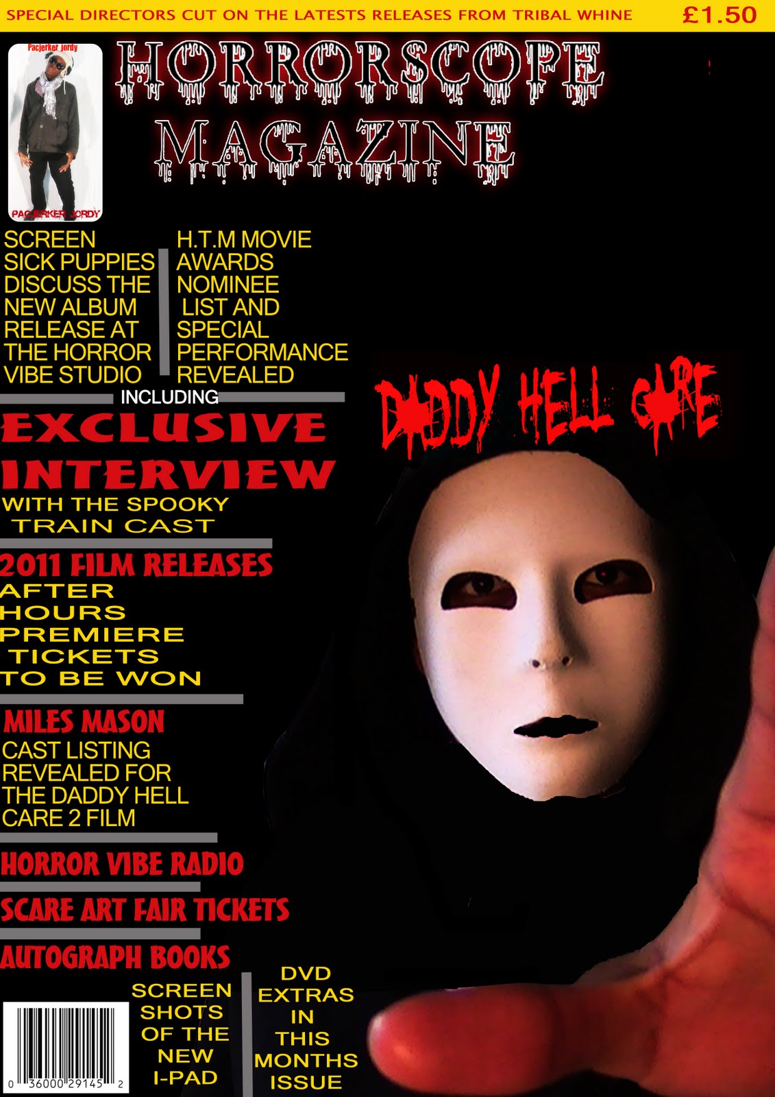
Our original magazine front cover received quite a lot of negative feedback mainly saying it didn't look realistic enough, the text was too cramped, colours weren't conventional of horror, our magazine title wasn't good enough and the image was poor. This for me is quite unfair because after looking at many Rue Morgue magazine front covers, they look quite similar to this.
For example we were told yellow wasn't a colour for horror yet after looking at Rue Morgue, they make extensive use of the colour yellow and this a magazine that specialises in horror in all forms so this must mean a professional magazine is getting it wrong along with us.
The title was also apparently unreadable from a distance so it had to changed to look clearer and our text on the left was indeed too cramped and so that needed to be edited. The image also was too small and there was too much empty space but this was improved on in our newer front cover.
No comments:
Post a Comment